Poke Bros.
-
Mobile Ordering App
This concept project explores how a dedicated mobile app could transform the ordering experience for Poke Bros., a fast-casual restaurant known for its customizable poke bowls. Without a branded platform, customers relied on third-party apps, often at the cost of customization, ease, and brand consistency.
Role
I was the sole designer responsible for UX research, wireframing, visual design, and prototyping the mobile ordering flow.
Type
Concept Project | UX & UI Design
Tool
Figma
Problems
Poke Bros. doesn’t currently have a dedicated app. Instead, customers rely on third-party delivery platforms with inconsistent user experiences, limited customization options, and none of the personality or branding that sets the restaurant apart in person. From a business perspective, this creates missed opportunities for customer retention, brand engagement, and order efficiency. I set out to design a direct-ordering experience that could solve these gaps while enhancing the convenience and delight of building your own bowl.
User Goals
Business Goals
Success Metrics
Learning from the Competition
I studied apps from Chipotle, Sweetgreen, and Pokeworks to identify what worked and what didn’t. Clear ingredient visuals and quick reordering stood out as must-haves. However, even well-designed apps had gaps in pricing clarity or personalization.
Insights
Impact


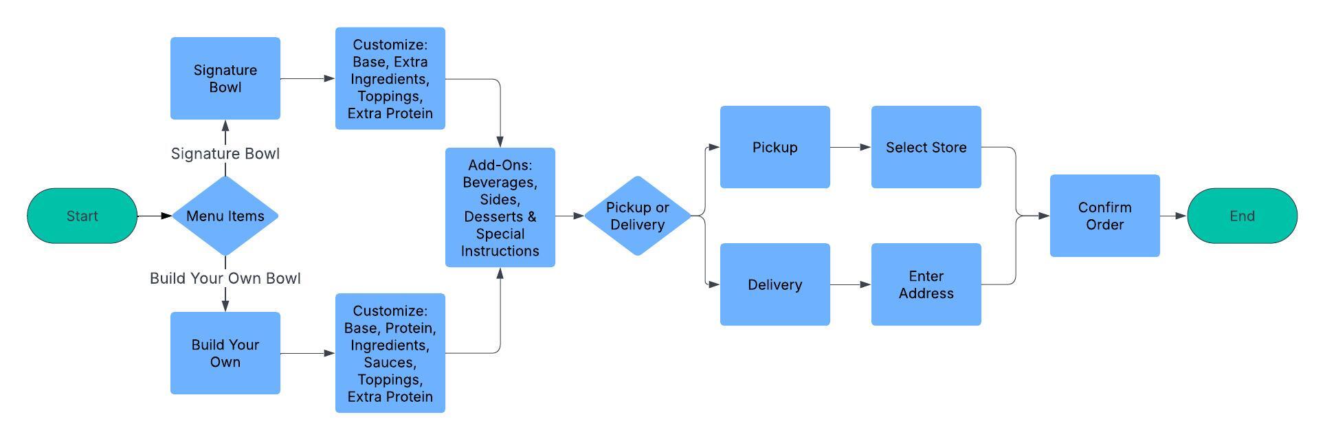
User Flow & Process
Too many decision points and a delay in showing updated pricing frustrated users.

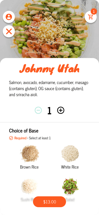
I streamlined navigation and reduced friction by surfacing pricing earlier and simplifying the build-your-own process.
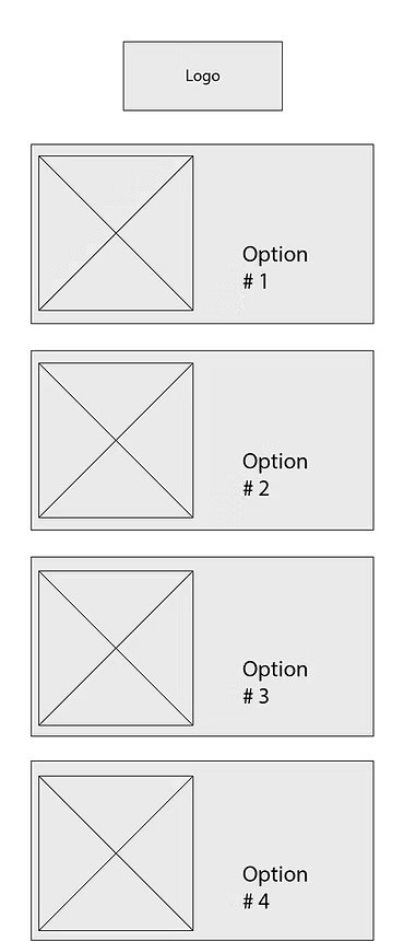
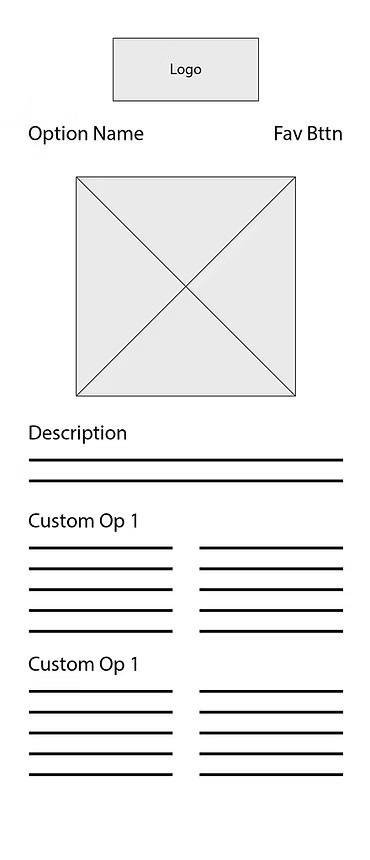
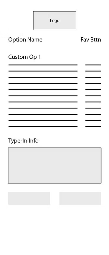
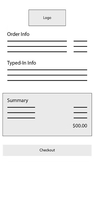
Sketches to Wireframes
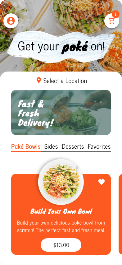
I started sketching early flows and structure. As the project matured, I pulled from Poke Bros.’ social and web identity—using bold color, bright imagery, and clean typography. Knewave adds a burst of personality for headers, balanced by News Cycle for legibility.


Branding
For the visual design, I kept to Poke Bros' playful but clean visual identity. I utilized their combination of Knewave for headlines and News Cycle for body copy to strike a balance between personality and legibility. The color palette reflects Poke Bros.’ vibrant branding. Clean whites with bright, coastal accent colors.


Results
Users can build a bowl with ingredient images and see price updates in real time. The design captures the brand’s energy while offering a streamlined, responsive interface.

A Strong Foundation For Future Features
This project helped me think deeply about fast decision-making and branded mobile UX. Next steps could include loyalty rewards, delivery tracking, and usability testing with a wider audience.